magazine
layout
defining
For this project, I was tasked with designing three distinct magazine layouts while using identical content. I needed to demonstrate my comprehension of typographic principles while experimenting with texture and hierarchy in the various approaches.
client
Eamesrole
Designerdeliverable
Magazine Spreadsservices
Print Design Typesettingsoftware
InDesign Photoshopideation
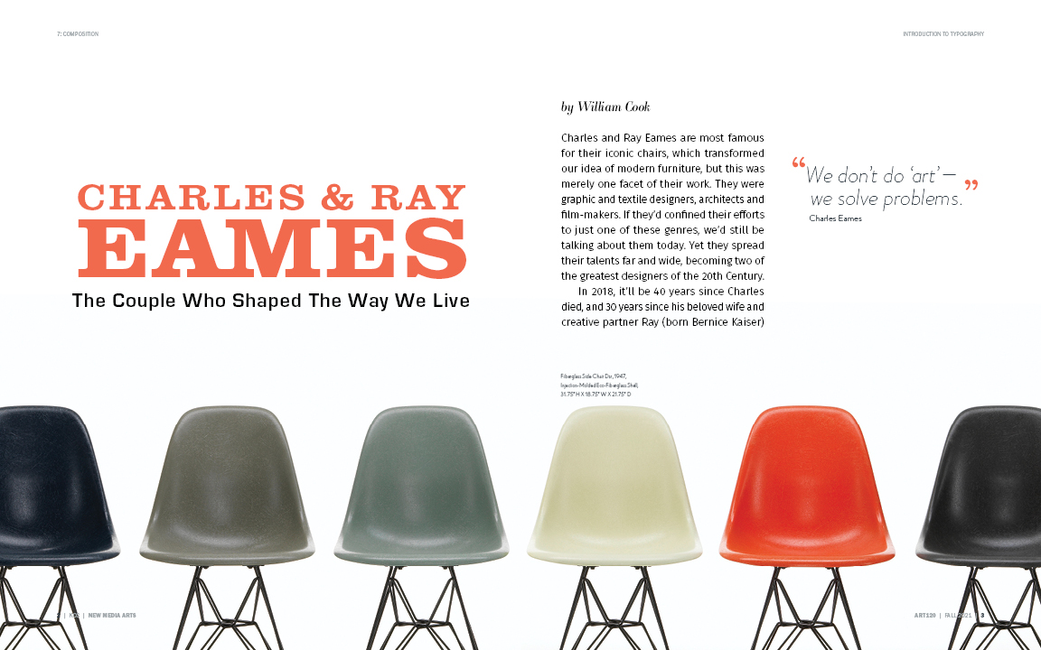
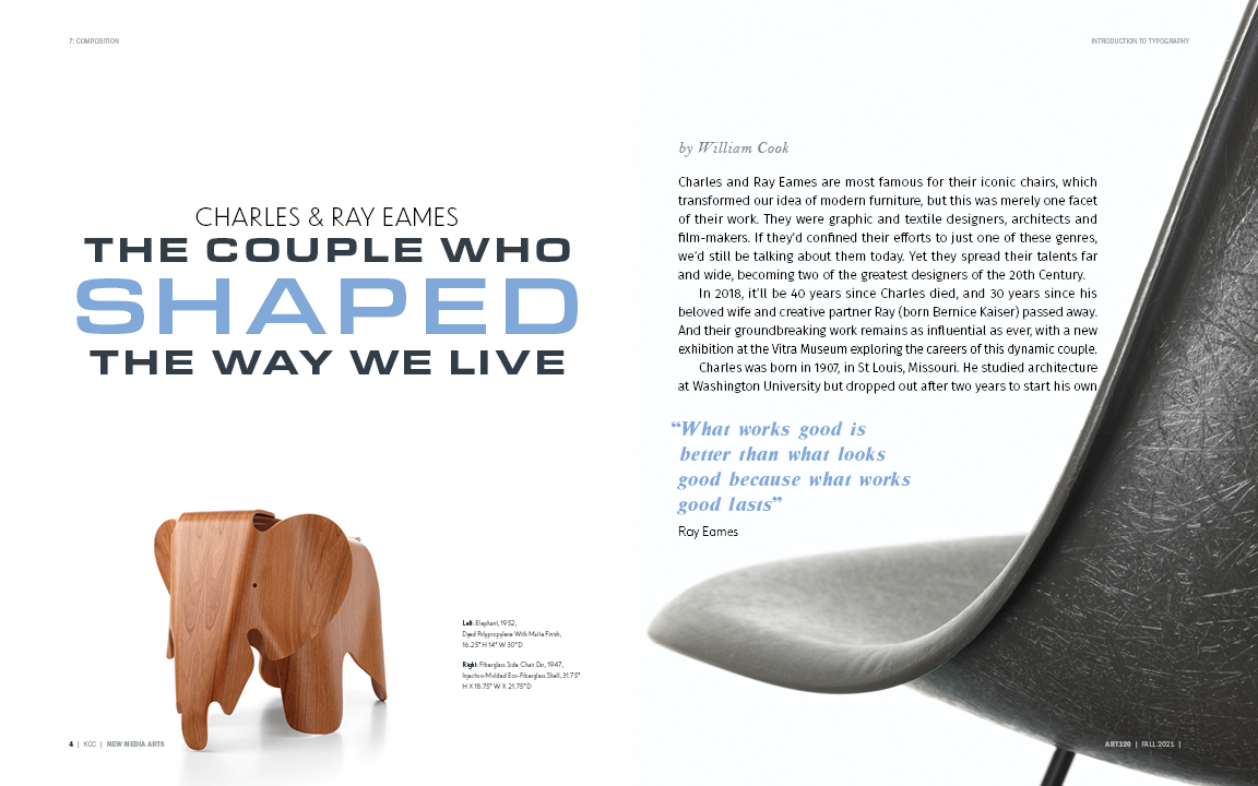
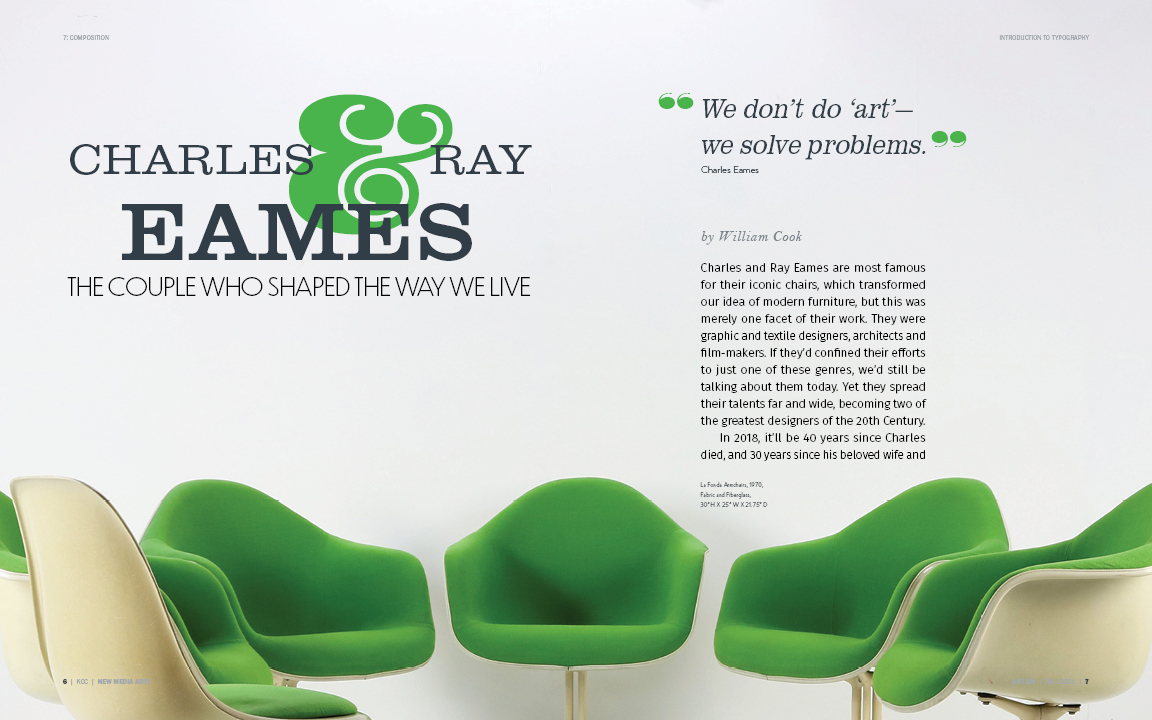
In order to start this project I needed to observe the selection of images we were given. I chose to do the image collection by Charles and Ray Eames, and the furniture that they crafted. The Eames' are known for their clean, modern aesthetic, and I wanted to ensure that the typefaces I chose would reflect that. For the titles, I primarily used Clarendon URW and Eurostile. I paired these typefaces with Fira Sans for the body copy as its clean design allows for better readability.
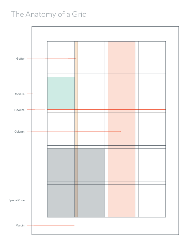
Before setting the type of the magazine layout I first ensured that I had a good grid to work with. This allowed me to visually space the header, subheaders, author of the article, body copy, and quotes while working around the images. The grid enabled me to set up the columns for the body copy and visually assess how much space they occupied to ensure proper line length.
After laying out all my content, I checked that there was enough space between lines,ensured the correct glyphs were used, and scanned for hyphens, widows, and orphans to ensure none were present. If any were found, I attempted to fix this by adjusting the word spacing or glyph scaling. I also ensured that my quotation marks were properly hung to avoid disrupting the flow of text.
design
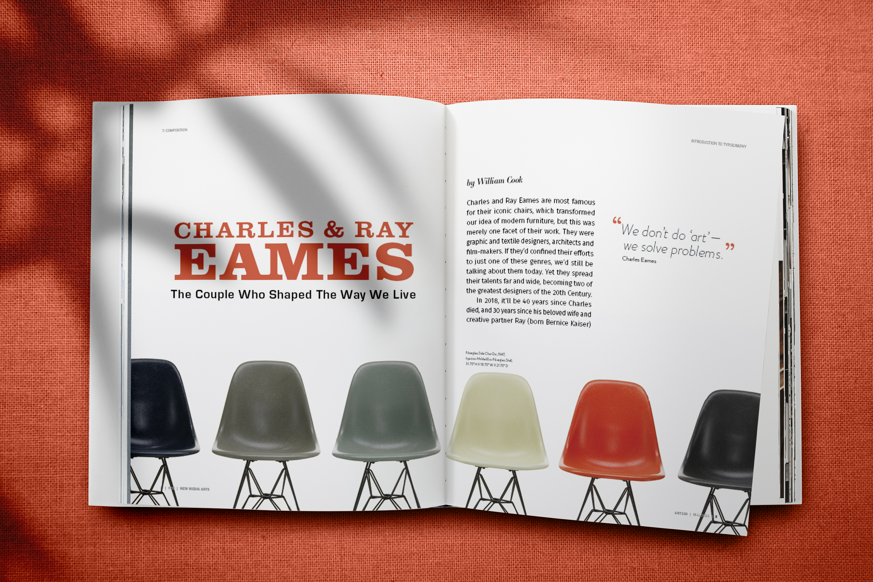
The magazine layouts I have created show my understanding of typographic rules. In each layout I had done my best to adhere to these rules to ensure consistency through each design. While they all feature similar content, I believe that each is unique and has its own distinct qualities.