quest
mead
defining
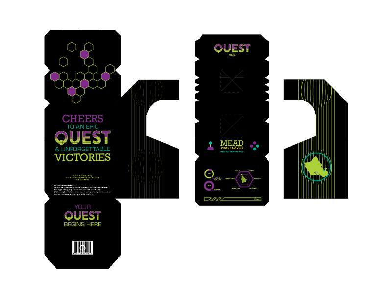
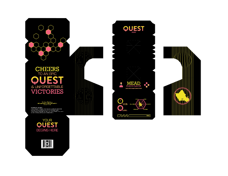
QUEST is a fictional mead brand inspired by video games, designed to bridge the gap between gaming and socializing. QUEST aims to help gamers forge lasting friendships and create unforgettable memories, all while enjoying unique mead flavors. The primary audience are gamers aged 21-35 who are looking to expand their social circle beyond virtual spaces. The overall theme of QUEST is based around arcades and the vaporwave aesthetic.
client
QUESTrole
Designer Photographerdeliverable
Packagingservices
Logo Print Design Packaging Brandingsoftware
Illustrator InDesign Photoshopideation
Vaporwave uses many bright, neon colors to create a retro, futuristic look. Keeping this in mind, I selected bold neon hues while also choosing a muted teal and tangerine shade to ensure a balanced color palette.
Selecting the type proved to be very challenging. While arcade machines and the vaporwave aesthetic typically utilize bold and graphic typefaces, I was concerned that these choices might overpower the brand and overshadow the brand's identity. These typefaces featured rounded corners, pixel art vectors, and a lot of uppercase lettering.
I chose to use Brandon Grotesque for the logo as it featured the rounded corners, and allowed me to alter the “Q” easily. The other typefaces chosen are Rockwell, a slab-serif that also consists of slightly rounded corners, and Eurostile, a geometric sans-serif. I tested each of these typefaces in uppercase and lowercase settings. It was important that each would lend to the overall packaging design as most of the copy would be in uppercase.
Drawing inspiration from the power button commonly found on electronic devices, I began designing the “Q” of the logo. I also incorporated elements of the iconic “sun” from the vaporwave aesthetics, modeling the entire logo after it and creating varying line weights to achieve the desired look.
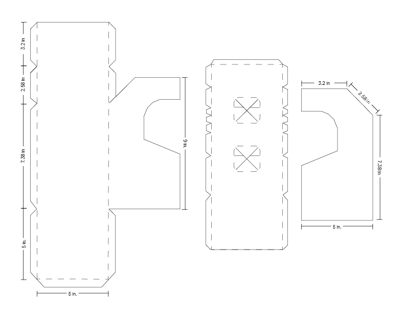
The biggest challenge I faced for this project was packaging. I aimed to create something unique, avoiding the reliance of pre-made templates. I modeled my package after arcade machines and went through numerous iterations to ensure correct dimensions. Additionally, I designed a template for the bottle to fit within the packaging. The bottle features a hexagonal base, symbolizing the honey from which mead is created.
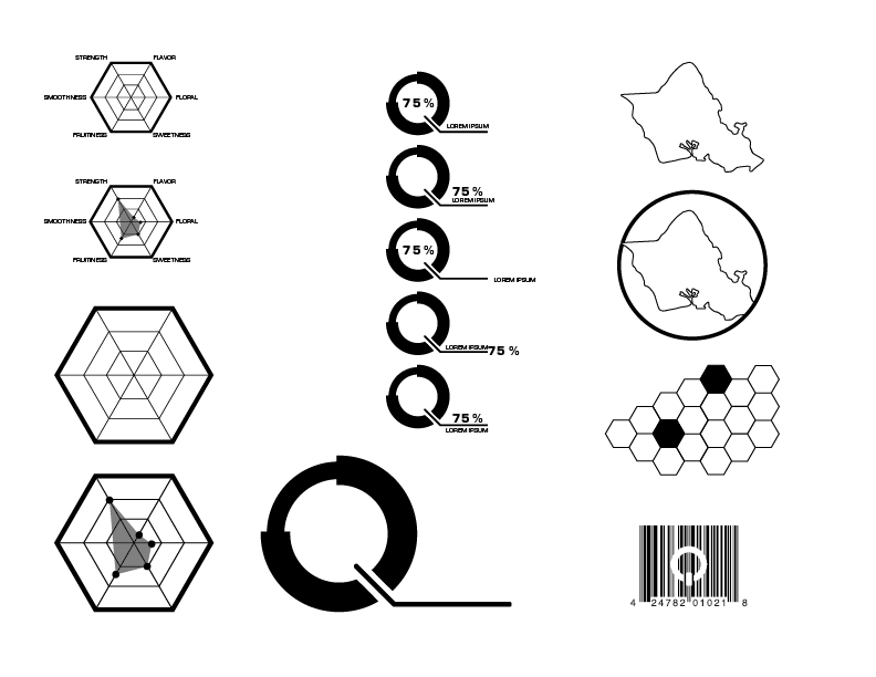
The graphics I created drew inspiration from video games and the heads-up display (HUD) commonly found in gaming interfaces. I incorporated a hexagonal shape to represent the various flavor notes of the mead and their intensity levels. I've also included a circular chart infographic resembling the letter “Q” to display percentages, such as alcohol by volume.
type & color
Logo
Data Visualization
Packaging
design
I believe that the research I had done, which led me to these design choices, allowed me to create a brand identity that best fits the company. Each element of the design, from the color to the type to the graphics and logo, was intentionally chosen based on the theme of arcades and the vaporwave aesthetic.